
Chat Infinite Dashboard
Overview
The Chat Infinite Dashboard was one of the most ambitious projects I’ve worked on. A full platform that allows clients to manage, train, test, and improve their AI chatbot. I led the entire product from scratch: mapping the user flows, designing the structure, crafting the UI, building prototypes, and preparing the full handoff.
The goal was to translate something technically complex into a dashboard that feels human, clean, and intuitive, even for non-technical users.
Categories
Dashboard Design
Client
Chat Infinite
Understanding the Vision
Before jumping into UI, I needed to understand how clients interact with a chatbot system on a daily basis. Most of them aren’t developers. They simply want to manage their bot easily, understand how it’s performing, and update content without worrying about technical workflows.
The challenge was to create a dashboard that felt:
simple but powerful
structured but not overwhelming
professional without feeling heavy
And most importantly, it had to scale. The dashboard would grow over time, more tools, more analytics, more integration points. So the foundation needed to be strong.
A Dashboard Built From the Ground Up
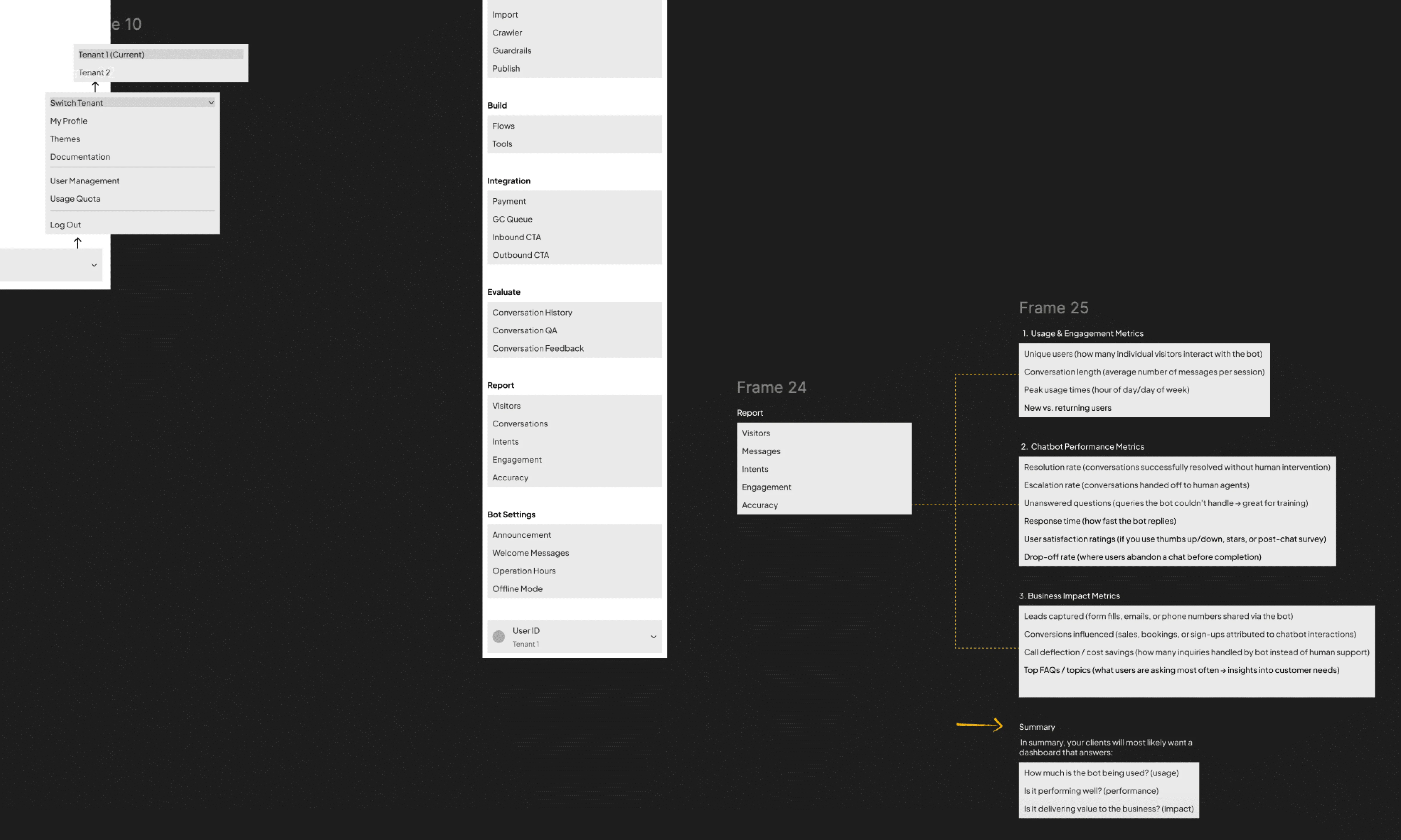
Since there was no existing system, I had the freedom to architect everything from scratch: navigation, categories, flows, terminology, and user hierarchy.
I mapped the dashboard into clear sections such as Home, Knowledge Base, Build, Evaluate, Integrations, and more. Creating a structure that mirrors how clients naturally work with their bots:
Build → Test → Evaluate → Improve → Publish.
Even though the dashboard is packed with capabilities, my goal was for users to never feel the complexity.

Home — Where Everything Begins
The Home screen became the heartbeat of the dashboard.
I designed it as a clean, high-clarity overview where clients can see:
quick analytics
platform-specific performance
recent activity
bot status
To keep the experience simple, I added tabs for WhatsApp, Facebook, and Web — letting clients switch between different platform insights with a single tap.

Conversation Lab — A Safe Place to Test the Bot
One of the most important areas is the Conversation Lab. A space where clients test their bot internally before any changes go live.
I designed it to feel like a natural chat interface: spacious bubbles, clear timestamps, and real-time responses. The lab reflects whatever content is filled into the Knowledge Base, making it easy for clients to see how their bot behaves with the latest information.
This page needed to feel friendly and safe, because testing often exposes mistakes. So the interactions are simple, predictable, and easy to reset.

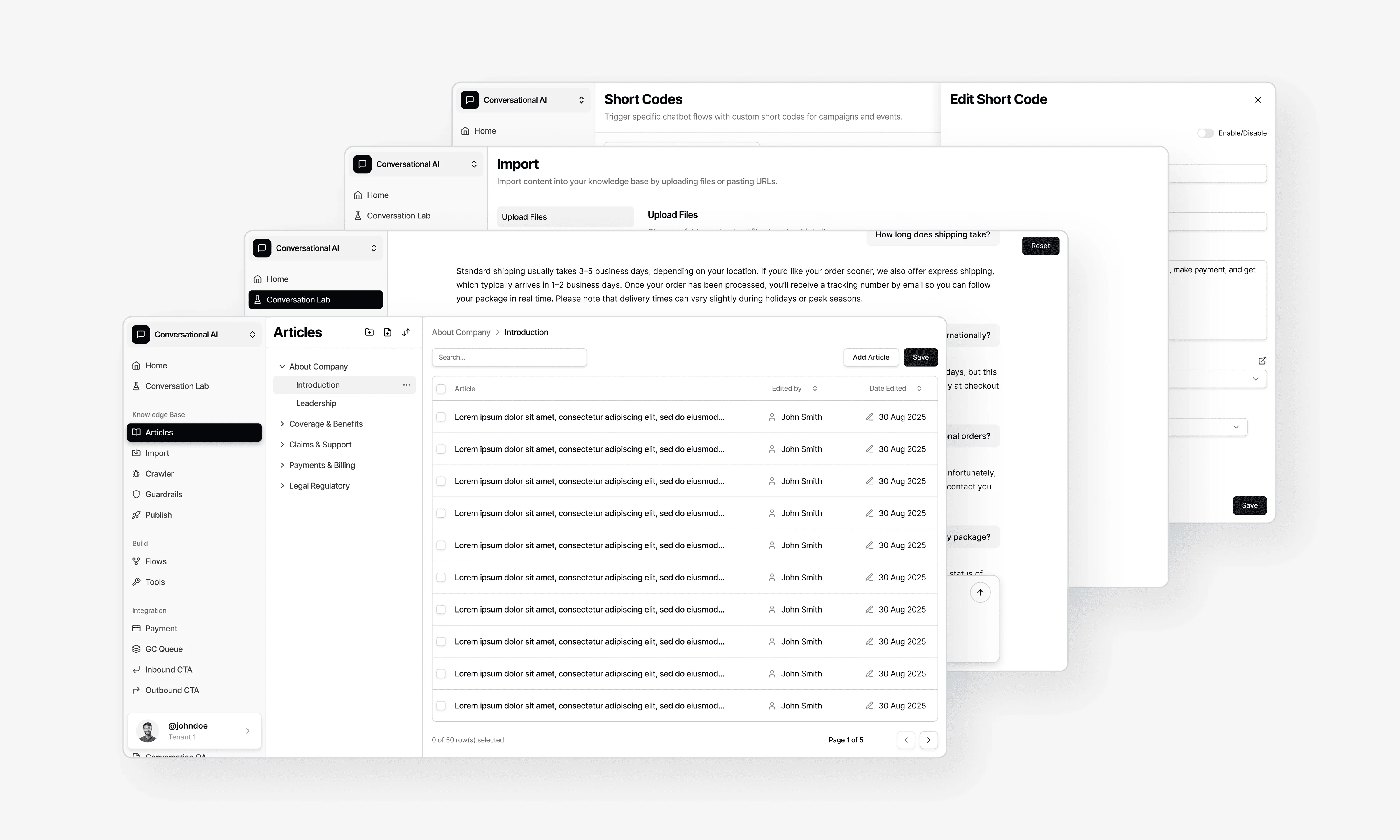
Articles — The Heart of the Knowledge Base
The Articles section is where clients build and shape their bot’s knowledge.
I designed it to feel like a clean content-writing tool. Much simpler than a CMS, but still flexible enough to organise information meaningfully.
Each article is presented in a neat card format, and the editor was designed with clarity and focus in mind: large text fields, intuitive grouping, and a layout that reduces cognitive load. Clients can write, update, and reorganise content without needing any technical skill.

Keeping It Professional — Why the Dashboard Uses Only Black, White, and Grey
The colour palette is intentionally minimal.
A monochrome design makes the dashboard feel:
clean and focused
professional and timeless
neutral across all industries
easy for teams who use it daily
With a tool this complex, colour should guide, not distract. The subtle palette supports clarity and reduces visual noise, letting users focus on what truly matters: their content, analytics, and bot performance.

Bringing Everything Together — Final Handoff
Just like my other major projects, I delivered a complete handoff package:
detailed user flows
fully organised Figma structure
desktop + responsive layouts
interaction notes
prototypes
component behaviors
“what happens next” descriptions for devs
Everything was documented so developers could build the dashboard without confusion or guesswork.
Outcome
The Chat Infinite Dashboard became a unified system that allows clients to manage their bot from start to finish. The interface feels clean, modern, and trustworthy. No clutter, just clarity. Even with powerful tools behind the scenes, the dashboard stays approachable for all users, regardless of technical skill.
Chat Infinite Dashboard
Overview
The Chat Infinite Dashboard was one of the most ambitious projects I’ve worked on. A full platform that allows clients to manage, train, test, and improve their AI chatbot. I led the entire product from scratch: mapping the user flows, designing the structure, crafting the UI, building prototypes, and preparing the full handoff.
The goal was to translate something technically complex into a dashboard that feels human, clean, and intuitive, even for non-technical users.
Categories
Dashboard Design
Client
Chat Infinite
Understanding the Vision
Before jumping into UI, I needed to understand how clients interact with a chatbot system on a daily basis. Most of them aren’t developers. They simply want to manage their bot easily, understand how it’s performing, and update content without worrying about technical workflows.
The challenge was to create a dashboard that felt:
simple but powerful
structured but not overwhelming
professional without feeling heavy
And most importantly, it had to scale. The dashboard would grow over time, more tools, more analytics, more integration points. So the foundation needed to be strong.
A Dashboard Built From the Ground Up
Since there was no existing system, I had the freedom to architect everything from scratch: navigation, categories, flows, terminology, and user hierarchy.
I mapped the dashboard into clear sections such as Home, Knowledge Base, Build, Evaluate, Integrations, and more. Creating a structure that mirrors how clients naturally work with their bots:
Build → Test → Evaluate → Improve → Publish.
Even though the dashboard is packed with capabilities, my goal was for users to never feel the complexity.
Home — Where Everything Begins
The Home screen became the heartbeat of the dashboard.
I designed it as a clean, high-clarity overview where clients can see:
quick analytics
platform-specific performance
recent activity
bot status
To keep the experience simple, I added tabs for WhatsApp, Facebook, and Web — letting clients switch between different platform insights with a single tap.
Conversation Lab — A Safe Place to Test the Bot
One of the most important areas is the Conversation Lab. A space where clients test their bot internally before any changes go live.
I designed it to feel like a natural chat interface: spacious bubbles, clear timestamps, and real-time responses. The lab reflects whatever content is filled into the Knowledge Base, making it easy for clients to see how their bot behaves with the latest information.
This page needed to feel friendly and safe, because testing often exposes mistakes. So the interactions are simple, predictable, and easy to reset.
Articles — The Heart of the Knowledge Base
The Articles section is where clients build and shape their bot’s knowledge.
I designed it to feel like a clean content-writing tool. Much simpler than a CMS, but still flexible enough to organise information meaningfully.
Each article is presented in a neat card format, and the editor was designed with clarity and focus in mind: large text fields, intuitive grouping, and a layout that reduces cognitive load. Clients can write, update, and reorganise content without needing any technical skill.
Keeping It Professional — Why the Dashboard Uses Only Black, White, and Grey
The colour palette is intentionally minimal.
A monochrome design makes the dashboard feel:
clean and focused
professional and timeless
neutral across all industries
easy for teams who use it daily
With a tool this complex, colour should guide, not distract. The subtle palette supports clarity and reduces visual noise, letting users focus on what truly matters: their content, analytics, and bot performance.
Bringing Everything Together — Final Handoff
Just like my other major projects, I delivered a complete handoff package:
detailed user flows
fully organised Figma structure
desktop + responsive layouts
interaction notes
prototypes
component behaviors
“what happens next” descriptions for devs
Everything was documented so developers could build the dashboard without confusion or guesswork.
Outcome
The Chat Infinite Dashboard became a unified system that allows clients to manage their bot from start to finish. The interface feels clean, modern, and trustworthy. No clutter, just clarity. Even with powerful tools behind the scenes, the dashboard stays approachable for all users, regardless of technical skill.


Let's Connect
© 2025 All right reserved
Created by Farris Rauf
Let's Connect
© 2025 All right reserved
Created by Farris Rauf
Let's Connect
© 2025 All right reserved
Created by Farris Rauf