
AIRE by Merryfair
Overview
AIRE was one of those projects that felt exciting right from the start. Merryfair wanted a chair that represented a new direction. Something lightweight, minimalist, and modern, without sacrificing the ergonomic DNA they’re known for. My task was to design the entire landing page experience for AIRE: the flow, the content, the visuals, and later, a complete handoff package for development.
Like ROOKEE, this project was built from scratch. But AIRE had a different energy, it wasn’t about growing kids; it was about modern Malaysians working, studying, and creating at home. AIRE needed a story that matched that lifestyle.
Categories
Web Design
Client
Merryfair

Understanding the Chair
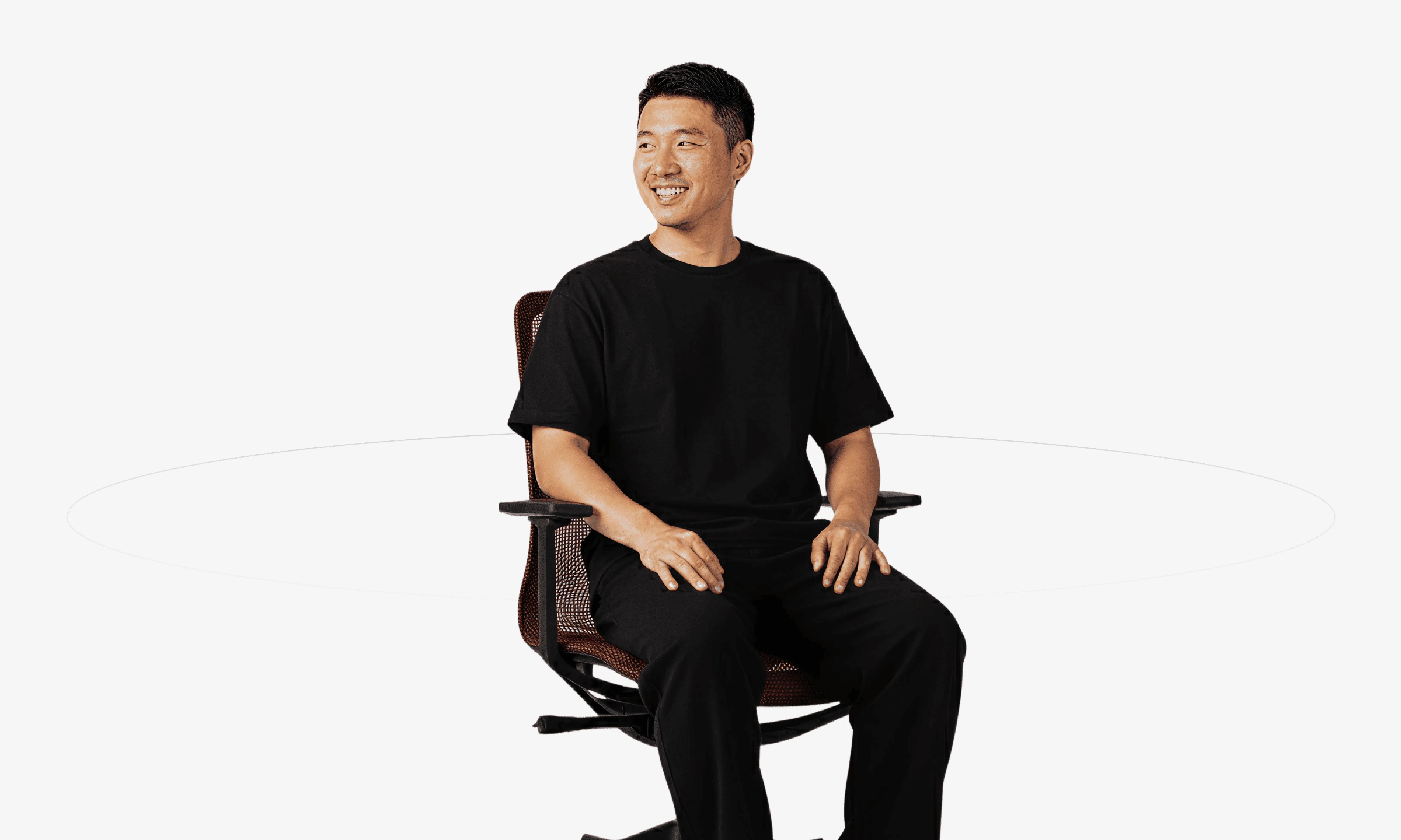
Before jumping into layouts, I spent time understanding what makes AIRE different. It’s light. Simple. Clean. A one-piece frame, breathable mesh, smooth mobility. All these elements felt like they belonged in a lifestyle product, not just a technical ergonomic chair.
AIRE wasn’t meant to dominate a room.
It was meant to fit into it naturally, quiet companion to your daily work, study, or creative time.
That idea shaped the entire direction of the landing page.

Shaping the Voice of the Design
While ROOKEE was playful and kid-friendly, AIRE needed a calmer, more lifestyle-oriented tone. I wanted the landing page to feel like it was speaking to someone who values focus, clarity, and comfort. Someone who appreciates good design but doesn’t want clutter.
So I leaned into three themes:
Lightweight Comfort
Effortless Support
Modern Living
The copy had to be simple, confident, and almost airy. Mirroring the chair’s personality.

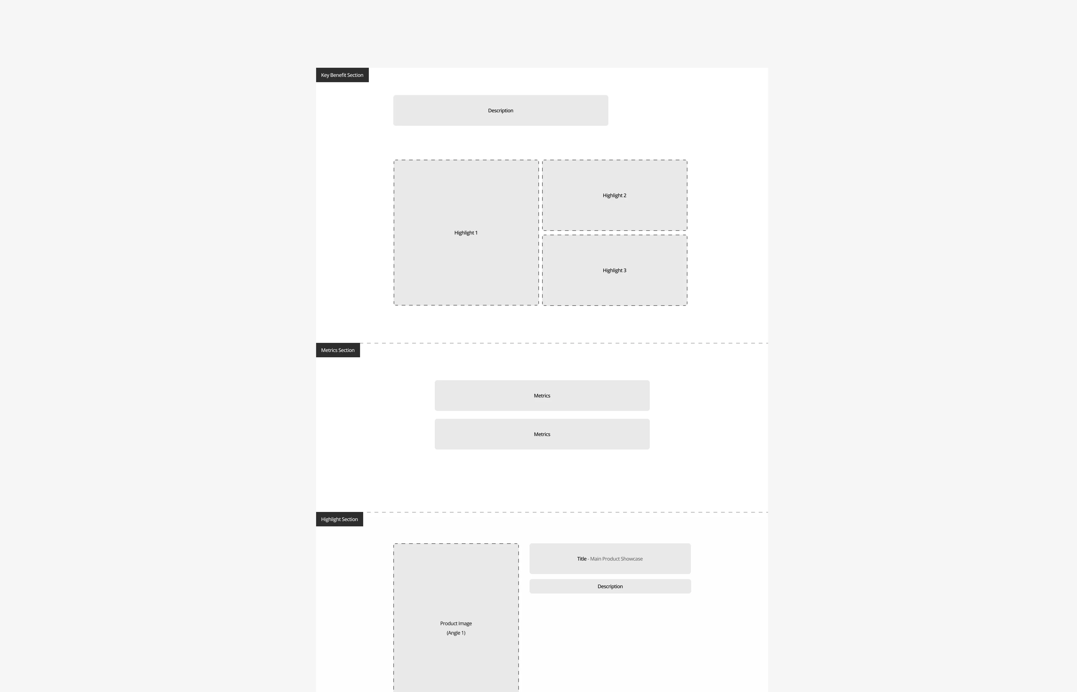
Designing the Structure
I approached the layout as a calm scroll experience, where each section revealed a small part of AIRE’s story:
A clean, bold hero introducing the concept of light ergonomics
A breakdown of core features: one-piece frame, breathable mesh, smooth mobility
A beautifully simple product presentation: minimal, but detailed
A comparison section showing how AIRE differs from traditional bulky chairs
A lifestyle angle explaining why AIRE works at home, not just in an office
A full specifications section for buyers who want details
A flexible color selector and “Shop AIRE” CTA for conversion
Everything had space to breathe.
Nothing felt heavy because the chair itself isn’t.

Bringing Light Ergonomics to Life
Designing the visual language was one of the most enjoyable parts. The page had to feel:
calm
modern
minimal
clear
quietly confident
I used plenty of open space, soft transitions, and clean typography so the chair could speak for itself. AIRE’s shape is simple and elegant, the layout needed to support that simplicity.
Images were displayed large, with no visual noise around them. Text was short and purposeful. The overall experience should feel like the product: light.

Full Handoff: Making Development Smooth
I delivered a complete, highly organised handoff package. Everything developers needed was neatly structured in Figma:
Desktop Design — the full layout with spacing, hierarchy, and component structure
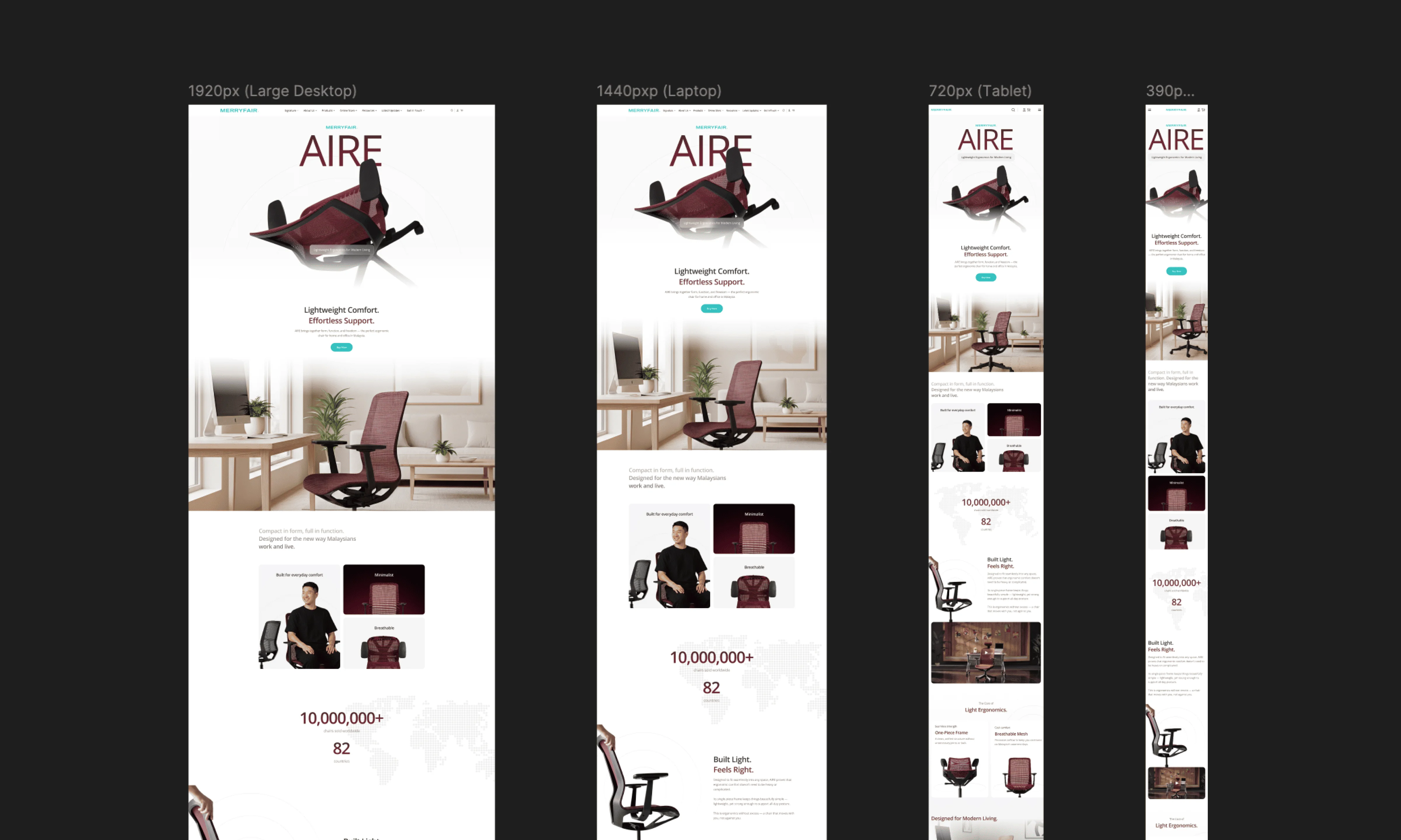
Mobile Design — responsive versions for smaller screens
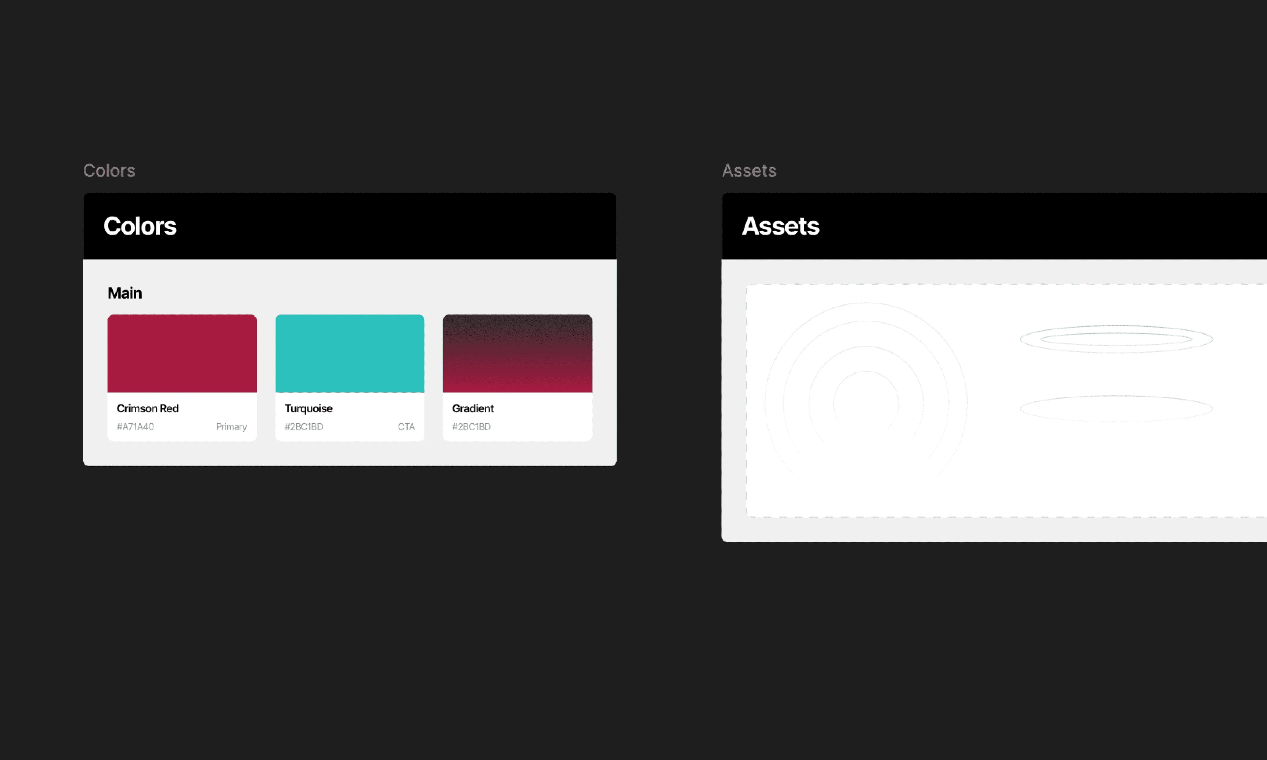
Mini Design System — typography, color palettes, spacing rules, components
Prototype — simple flows showing transitions and section behaviors
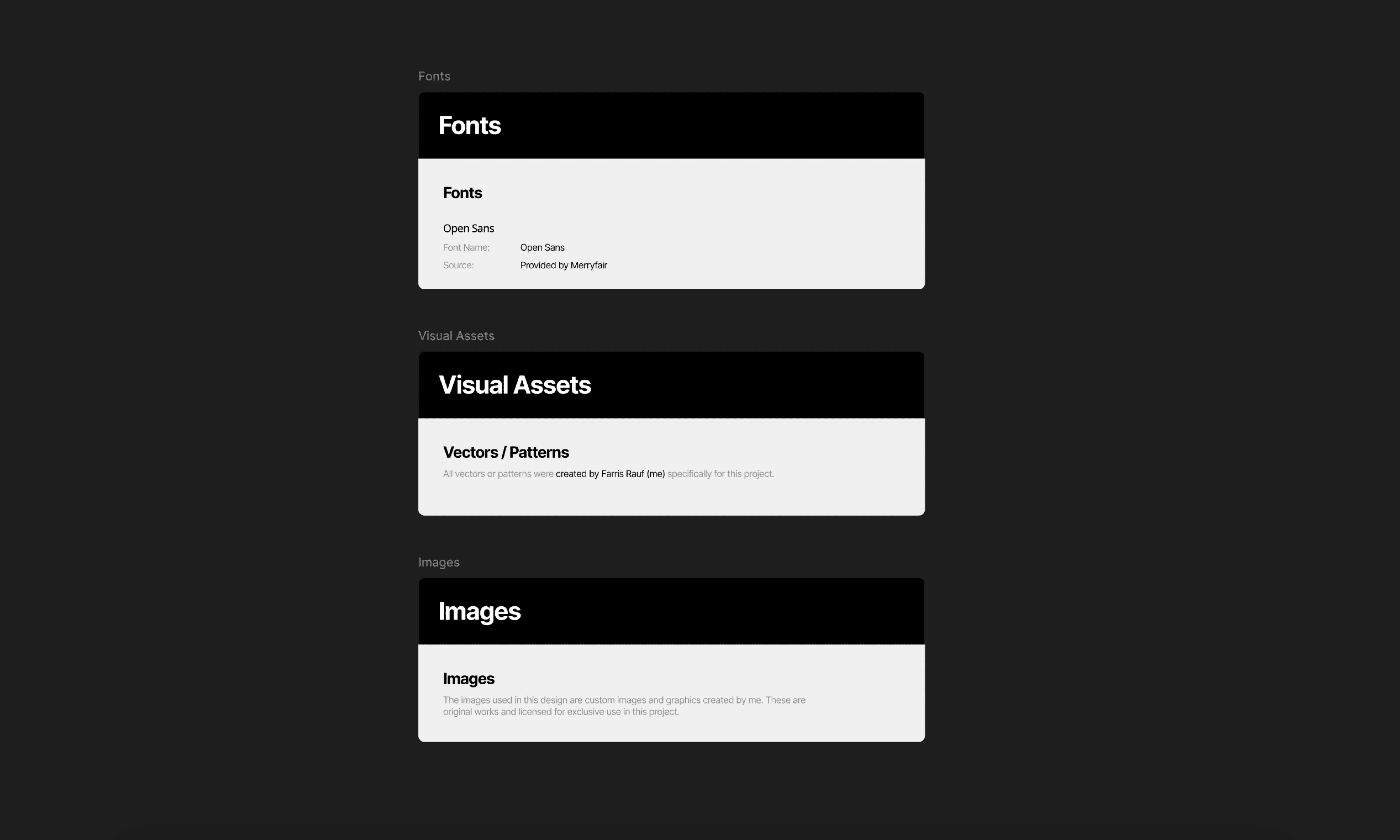
Licensing & Assets — product photos, icons, fonts, and usage rights
The goal was simple: clarity. Anyone opening the file should immediately understand how the page works.
Outcome
The final AIRE landing page tells the product’s story in a calm, confident way just like the chair itself. It highlights what makes AIRE unique without overwhelming users with technical jargon. Everything feels intentional, from the layout to the pacing to the copy.
Although there wasn’t formal A/B testing, the feedback was consistently positive. People understood the chair quickly, recognized its strengths, and felt its lifestyle appeal. The landing page now serves as a strong part of Merryfair’s digital product lineup, aligning perfectly with the brand’s modern direction.
AIRE by Merryfair
Overview
AIRE was one of those projects that felt exciting right from the start. Merryfair wanted a chair that represented a new direction. Something lightweight, minimalist, and modern, without sacrificing the ergonomic DNA they’re known for. My task was to design the entire landing page experience for AIRE: the flow, the content, the visuals, and later, a complete handoff package for development.
Like ROOKEE, this project was built from scratch. But AIRE had a different energy, it wasn’t about growing kids; it was about modern Malaysians working, studying, and creating at home. AIRE needed a story that matched that lifestyle.
Categories
Web Design
Client
Merryfair
Understanding the Chair
Before jumping into layouts, I spent time understanding what makes AIRE different. It’s light. Simple. Clean. A one-piece frame, breathable mesh, smooth mobility. All these elements felt like they belonged in a lifestyle product, not just a technical ergonomic chair.
AIRE wasn’t meant to dominate a room.
It was meant to fit into it naturally, quiet companion to your daily work, study, or creative time.
That idea shaped the entire direction of the landing page.
Shaping the Voice of the Design
While ROOKEE was playful and kid-friendly, AIRE needed a calmer, more lifestyle-oriented tone. I wanted the landing page to feel like it was speaking to someone who values focus, clarity, and comfort. Someone who appreciates good design but doesn’t want clutter.
So I leaned into three themes:
Lightweight Comfort
Effortless Support
Modern Living
The copy had to be simple, confident, and almost airy. Mirroring the chair’s personality.
Designing the Structure
I approached the layout as a calm scroll experience, where each section revealed a small part of AIRE’s story:
A clean, bold hero introducing the concept of light ergonomics
A breakdown of core features: one-piece frame, breathable mesh, smooth mobility
A beautifully simple product presentation: minimal, but detailed
A comparison section showing how AIRE differs from traditional bulky chairs
A lifestyle angle explaining why AIRE works at home, not just in an office
A full specifications section for buyers who want details
A flexible color selector and “Shop AIRE” CTA for conversion
Everything had space to breathe.
Nothing felt heavy because the chair itself isn’t.
Bringing Light Ergonomics to Life
Designing the visual language was one of the most enjoyable parts. The page had to feel:
calm
modern
minimal
clear
quietly confident
I used plenty of open space, soft transitions, and clean typography so the chair could speak for itself. AIRE’s shape is simple and elegant, the layout needed to support that simplicity.
Images were displayed large, with no visual noise around them. Text was short and purposeful. The overall experience should feel like the product: light.
Full Handoff: Making Development Smooth
I delivered a complete, highly organised handoff package. Everything developers needed was neatly structured in Figma:
Desktop Design — the full layout with spacing, hierarchy, and component structure
Mobile Design — responsive versions for smaller screens
Mini Design System — typography, color palettes, spacing rules, components
Prototype — simple flows showing transitions and section behaviors
Licensing & Assets — product photos, icons, fonts, and usage rights
The goal was simple: clarity. Anyone opening the file should immediately understand how the page works.
Outcome
The final AIRE landing page tells the product’s story in a calm, confident way just like the chair itself. It highlights what makes AIRE unique without overwhelming users with technical jargon. Everything feels intentional, from the layout to the pacing to the copy.
Although there wasn’t formal A/B testing, the feedback was consistently positive. People understood the chair quickly, recognized its strengths, and felt its lifestyle appeal. The landing page now serves as a strong part of Merryfair’s digital product lineup, aligning perfectly with the brand’s modern direction.


Let's Connect
© 2025 All right reserved
Created by Farris Rauf
Let's Connect
© 2025 All right reserved
Created by Farris Rauf
Let's Connect
© 2025 All right reserved
Created by Farris Rauf